Don’t you just hate improvements that aren’t really improvements? Sometimes companies are so eager to make a change, they forget that things that work properly might be better off as they were. A few examples:
Blogger.com has changed the front page and added an extra link in order to log in.

This is how it used to look.

In the old version the cursor was placed in the “username” box by default but in the new version you have to click “Sign in to Blogger” to get to that position. Now, say that Blogger has about 5 million users that log on twice a week. Hey presto, we have now created 10 million unnecessary clicks per week!
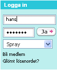
Second example. The Swedish portal Spray redesigned its site recently and moved the order of the boxes. If you use the tab key to move between boxes, like I do, you notice that the drop down meny where you can choose what to log on to, is now after the login button (“Ja”). That means that if I use the tab key to log on, I will not be able to go directly to my mail inbox like I used to and I need one extra click to get where I want.

Third example. Kungsörnen is a Swedish producer of, among other things, pasta. A while back they change the size of the pasta cartons into this incredibly tall but slim box. Problem is, that it is too high to fit the shelves in most Swedish kitchens. How can you design a product that is impossible to store? You don’t store an opened box lying down.

These examples aren’t huge problems, but consumers aren’t that loyal these days so a small impairment might be what pushes some to switch to another supplier.
PS. It freaks me out when I google stuff, and find my own blog popping up among the top results, like here.